|
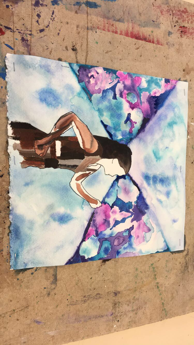
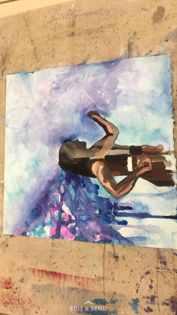
The last 9 weeks have been the greatest artistic challenge I have pursued. I have become so much more excited about art and the entire class I have been excited to put in the work and effort behind these projects. I think that I have truly grown as an artist from start to finish. The first piece I struggled with, but into Metamorphosis I definitely improved my watercolor skills and made a smooth transition into new mediums such as acrylic and ink. Finally, the final social commentary project allowed me to conintue the blue color scheme that I genuinely adore and have used this whole class. The continuity of blue throughout this class highlights my growth stylistically from project to project. The encaustic was exciting to work with and it's a great future outlook for my future in art. 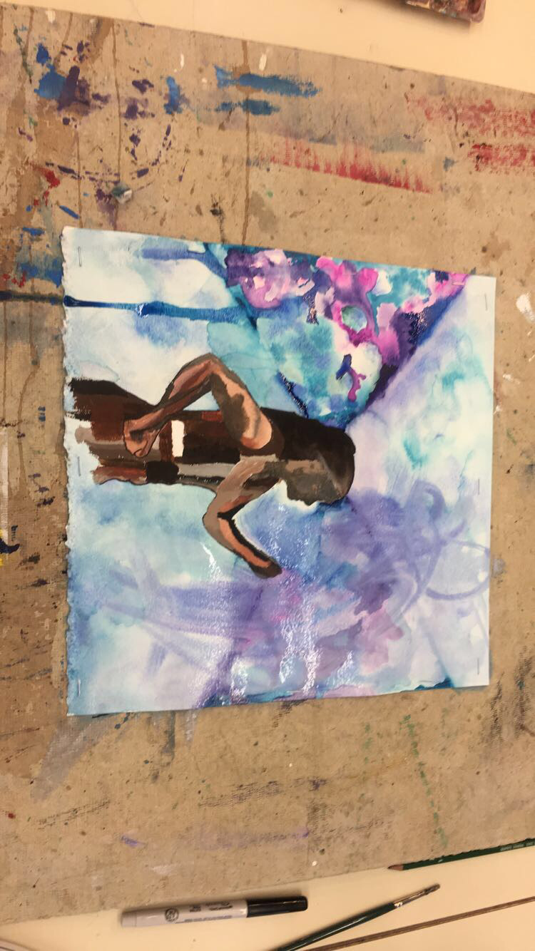 My first piece is something I can barely look at now but the watercolor experience was a lot of fun. The concept of the self portrait was very challenging for me and I think that there are many ways I could have improved; developing the face and body, cropping the piece down to be asymmetrical, etc. However I think this shows the breadth of my work in this class. This first project is a benchmark and really shows my improvement and development artistically, in the watercolor concentration and beyond. 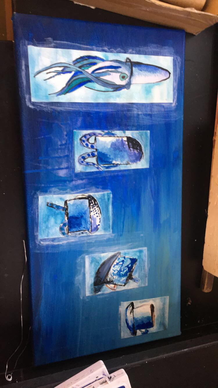 In metamorphosis, I was excited and immediately married to the idea of a teacup into a squid. I think the transition from watercolor to mixed media- watercolor and acrylic- was a cool opportunity to see my growth. 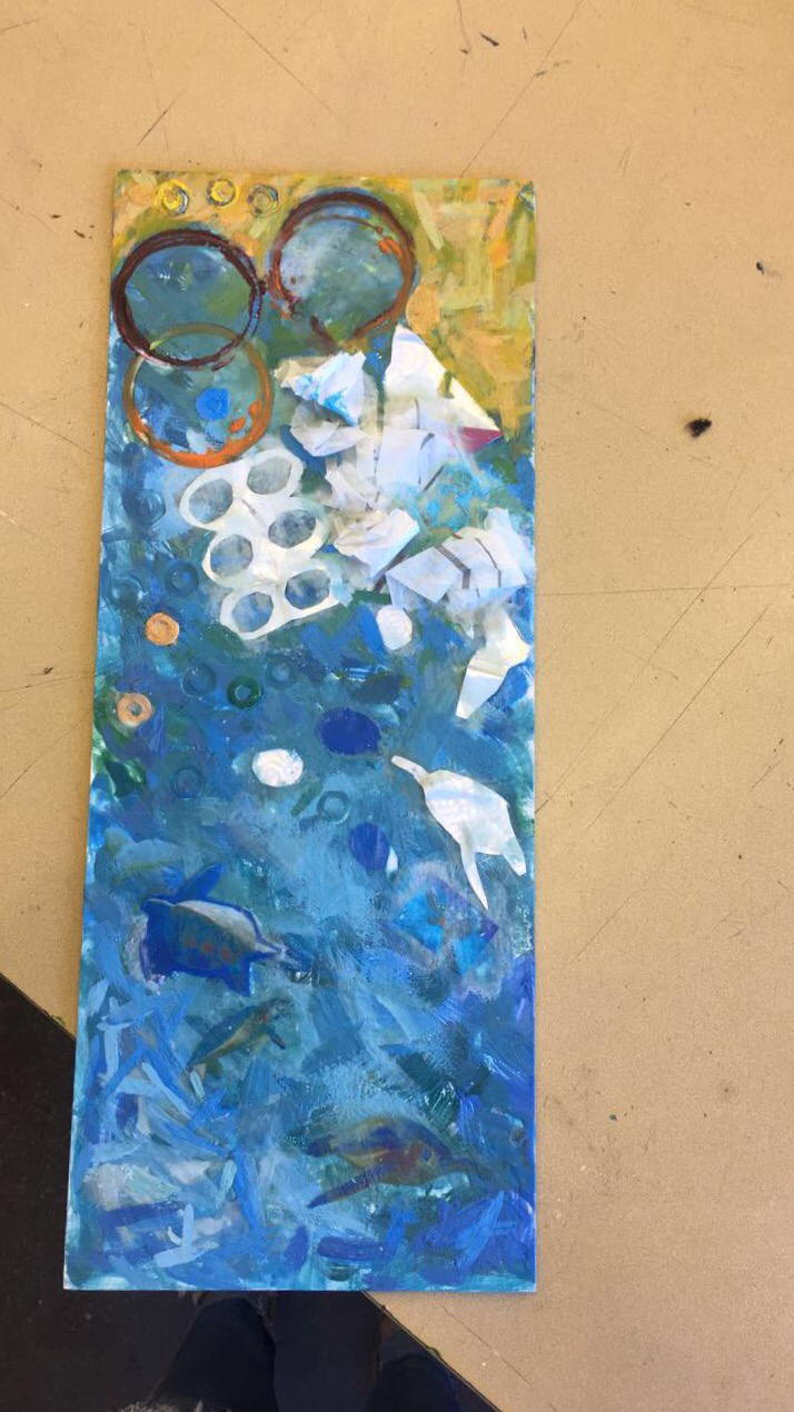 This is my final project from Portfolio. This social commentary piece is inspired by environmental influences, and also incorporated the previous technique of metamorphosis as I transitioned the turtles to the air bubbles the respire to trash in the ocean. Working with the new medium is very exciting, and I definitely am very excited and happy that I tried encaustics. This is a great platform to build off of into my own individual future in art.
0 Comments
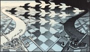
The objective of this project was to create a piece that had a narrative or rhetorical message behind imagery. I decided to use pollution of the environment as my topic for this project as it is something I have always been passionate about. It also fits into my 'blue' theme of art projects for this class so far, which is cool. As always, deciding which medium to use was a long, twisting winding road. My original thoughts were 3D, but I couldn't decide if paper sculpture or cardboard sculpture would really work the way I envisioned and eventually ENCAUSTICS fell into my lap. Other people in the class began using it and the supplies were already available. I watched the demonstration in class and all the encaustic work I had seen so far was stuff I was interested in making myself. Foolishly, this process of actually figuring out what I actually wanted to do and which medium took up a lot of studio time, so I had to get moving with just less than a week of studio time left. Here are some inspirational encaustic pieces I found:  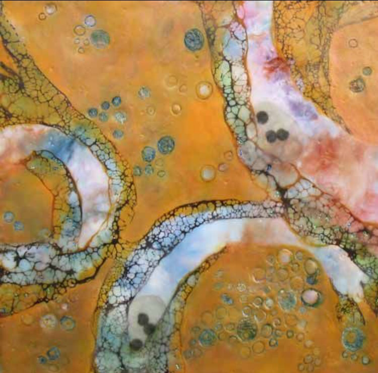  Below is my compositional sketch. I incorporated the basic elements of sea life, pollution, and horizon line but de-structured it a little bit in order to give the piece a looser feel. Note that this sketch was intended for a 18X18 piece of plywood, but after reconsideration I ended up using a rectangular board instead so the foundation had to be slightly rearranged. 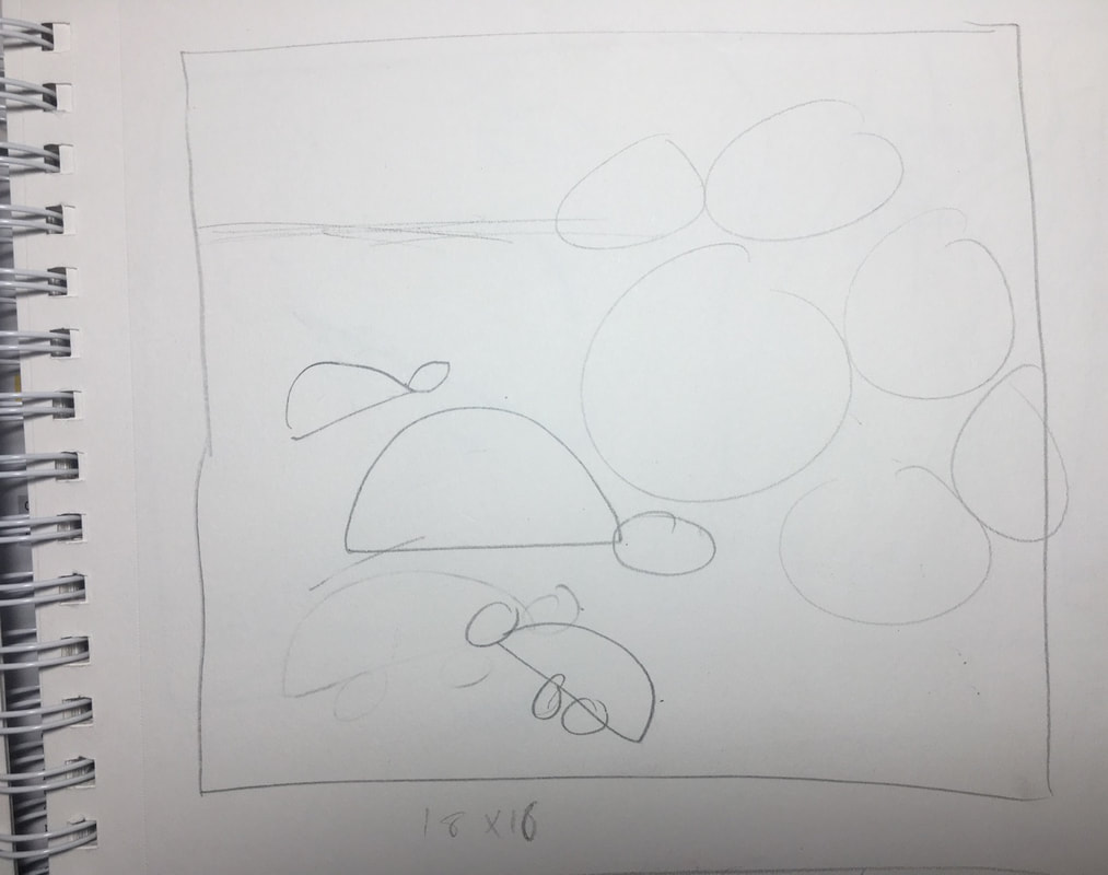 With the help of Mrs. Maclay we found a long rectangular piece of wood that we deemed sufficient. The first few steps of the actual project were sanding the board down, with sandpaper, to make it smoother and softer. Next I gesso-ed over the entire board, front back and in between for a base layer. Finally I could begin playing with the wax. I used cerulean blue, dark green, white, clear, and yellow in the board and mixed them to get different shades to help emphasize the deeper ocean and the closer to the surface. I used quick, short brush strokes to cover the board. The wax is fun, but it dries very quickly and so the swift strokes worked in my favor.  I was really happy with the way the background turned out. The texture that the wax gives and the depth the clear wax adds is interesting but not too messy and rough. The wax is smooth enough to capture the smooth waves of water and the color scheme is something I am most fond of. When I asked people in the class what they had thought of it so far, they replied with "ocean" so that was good that it was recognizable. I found a piece of gold wax and got really excited about it, so I found some yellows and white to mix together to quickly brush on the top of the piece to help emphasize the surface and horizon line. Next, I turned the board vertically. I cut out colored images off turtles with an exact-o-knife and used the clear wax as an adhesive to paste them into the painting down to the blue, darker toned deep sea. Next, I used the scraps of blue printed ink from the pictures to cut out circles representing bubbles from the turtles. Sea turtles have to come up for air and the bubbles coming from them eventually turned into circles of trash that they were breathing out, and finally evolved into a 6-pack soda ring. It was cool to incorporate an element of metamorphosis into the piece using this and I think it shows some growth in skills I have learned over the past 9 weeks. I also cut out a turtle shadow out of trash to help this imagery. From this point I began making the piece more decadent. I used tissue paper and paper towels to add a 3D element by attaching them to expand on the trash in the water, putting it near the soda rings to keep my element of metamorphosis intact. Inside of that, I scratched out the symbol paired with the saying, "reduce, reuse, recycle" by using a tool to carve out the arrows. Then I filled it with light blue acrylic paint and wiped it away to fill in the carving. Unfortunately I let the acrylic dry for too long and had to scrape the excess paint off with tools but it still is a really cool design to add to the piece and strongly reinforces my social commentary aspect of the piece. The location of it, too enhances the message I am giving off as I put in literally in the floating trash. Other finessing flairs I added were the circles just above the 6-pack soda rings (metamorphosis!) by taking the cans of wax and circling the bottom in wax on the hot plate and pressing it into the board. The purple and orange are really cool contrasting colors I think. I also got to use a nut/bolt to imprint more circles into the piece and I added a horizontal line of three circles at the left hand corner to add some element of design and geometry. 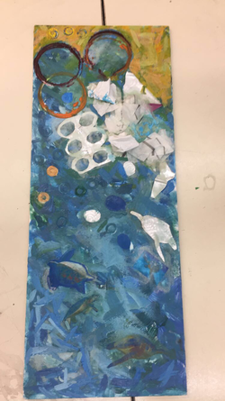 The final piece I am excited that I got to try encaustics and collaging, as coming into this class were two things I wanted to try and learn about. I love the look of encaustics and it may be my favorite medium to work with now. I absolutely love the blue brush strokes in the background. I am also really happy with the result of my piece and the positive excitement I have gotten from encaustics, it is a good way to go out from the Portfolio class and gives me a platform to dive off into artistically now that this class has ended.
Schools of Interst: University of Pittsburgh & Bosto University The primary reason I chose these schools as I have strong interest in attending these schools for separate programs unrelated to art, but I am interested in continuing my art education while I am there. I will research specifically the art departments offered by these schools.
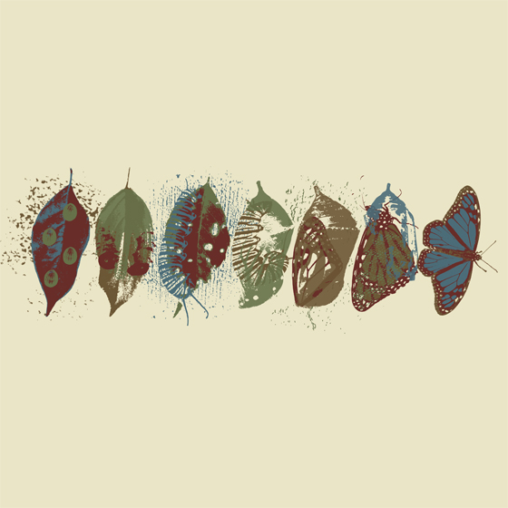
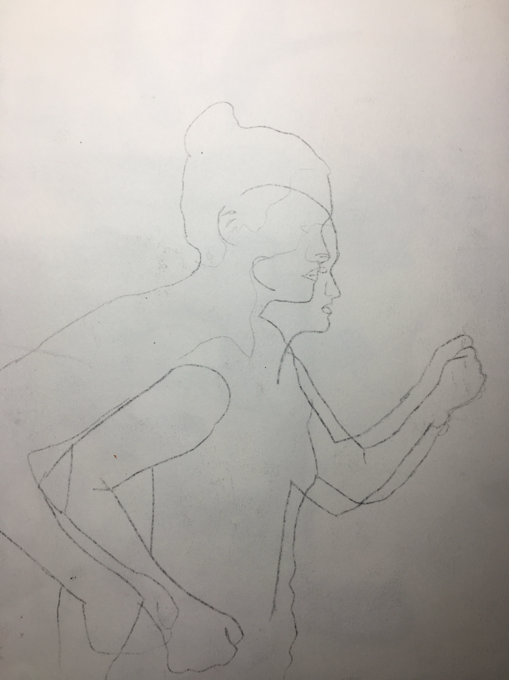
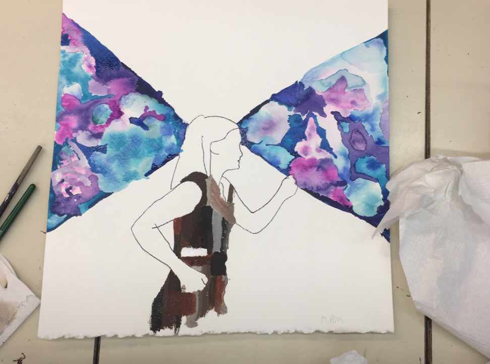
Just as a recap, the main idea of this project was to turn one inanimate object into another inanimate or animate object using at least 6 stages to metamorphosis to use as a transition from one subject to another. My inspiration for the subjects for this project originated from the studio's field trip to Harrisburg's State Museum and the Millworks galleries. As I looked back on photos from the artist exhibits, I saw a a painting of a squid that I particularly liked, and a collage of a teacup that I also grew a liking too, and right then and there I got totally, completely married to this idea, for better or worse. 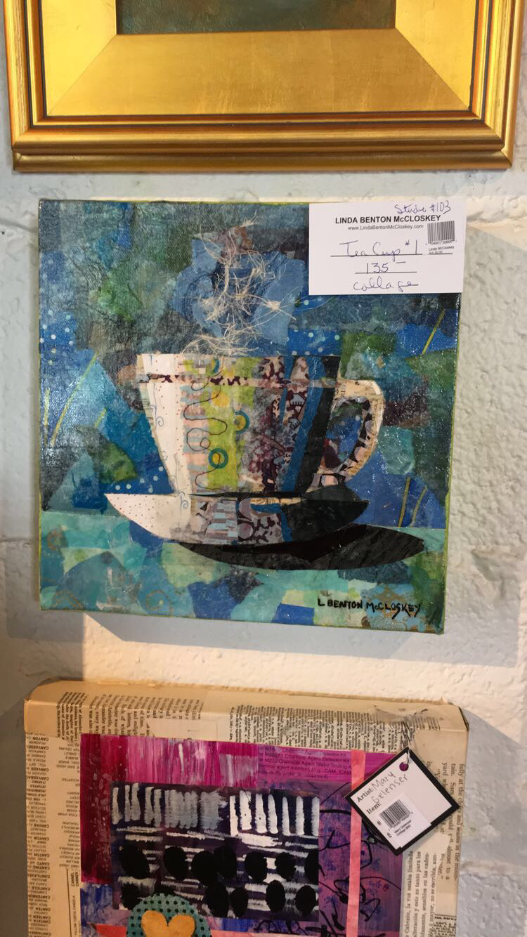  (the squid is in the back of the studio) However I immediately ran into challenges. While I got the transitions down in my sketchbook, I had a lot of trouble with the composition of it. Teacups and squids really don't share a similar environment like EVER, since one is deeply underwater and teacups aren't really in the ocean that much. I spent a significant amount of time sketching the transitions in thumbnails and practicing water coloring the objects. 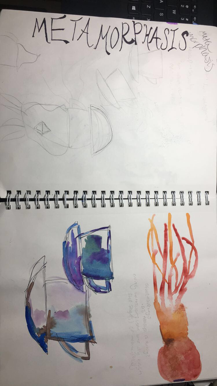 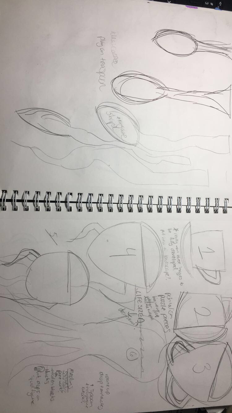 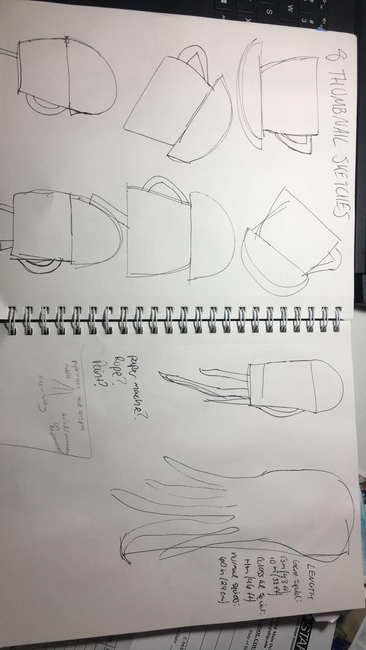 I also encountered a challenge when I was picking a medium. I think that one of the most exciting aspects of an open studio class is the opportunity to learn about a vast array of mediums & techniques, and I really wanted to take advantage of that. Since the last project I did was pretty much just watercolor, I was hoping that printmaking would be a new way to communicate the metamorphosis and give me a good learning opportunity in a new skill set. I also tried some oil pastels mixed with watercolor out, too. I started working some different approaches out in my sketchbook as well for practice, located below: 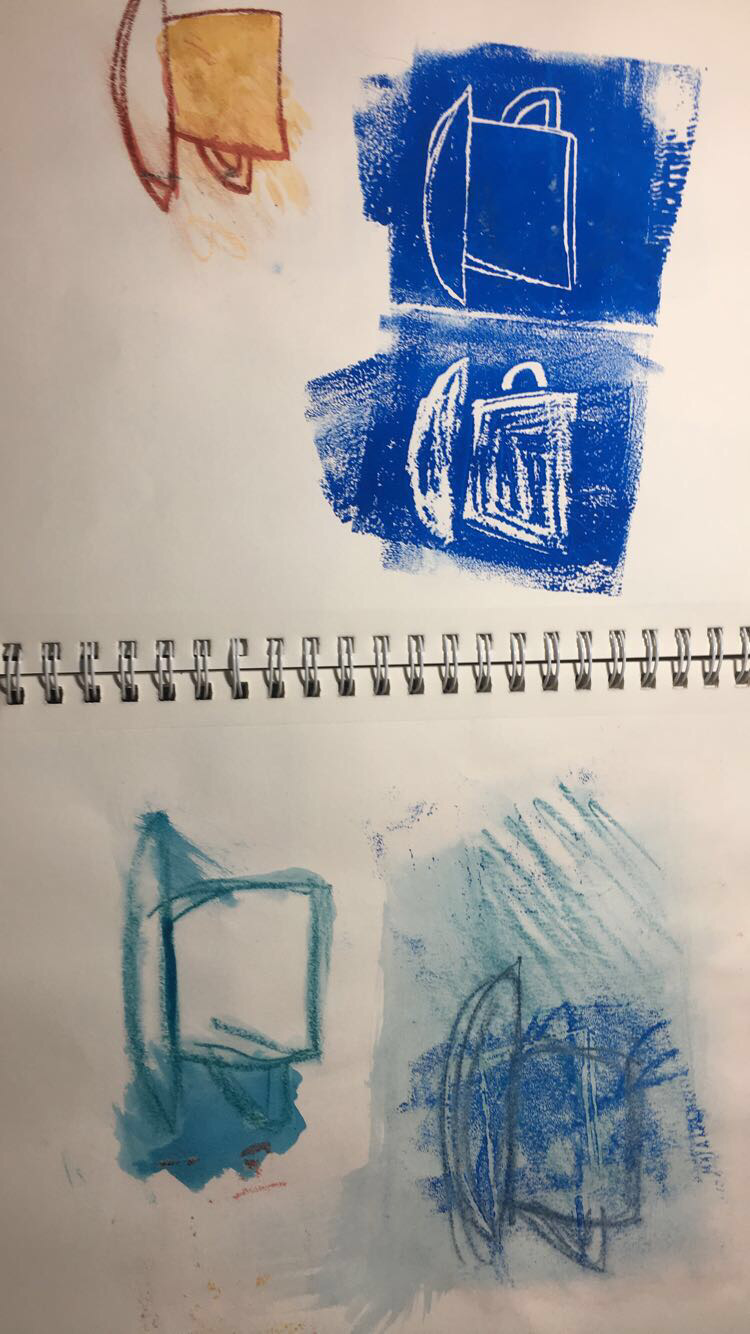 In the end, however, I decided that none of these methods really had the likeness and style that I had envisioned and gotten married too. I felt that with printmaking, the detailing wouldn't be able to be at the level I wanted, and the oil pastel work I had done with watercolor was too similar to what I had done on the last project and I wanted to branch out more... ...So of course I ended up back at watercolors and ink to do the transitions on some basic white watercolor paper to get the project up and running finally. I really enjoyed and had fun with the illustrative teacups I had done earlier in my sketchbook and really wanted to play off of that stylistically. So I went ahead and created 6 stages of metamorphosis in a fine point sharpie and began using mostly blue hues and some purple to add values and shades for fun. As they progressed, Mrs. Maclay suggested that I incorporate ink into it more to reinforce some lines and embrace the stylistic nature of it. I used basic quill in ink to add more value and define the shapes a bit more to make them more realistic and bold by cross-hatching. 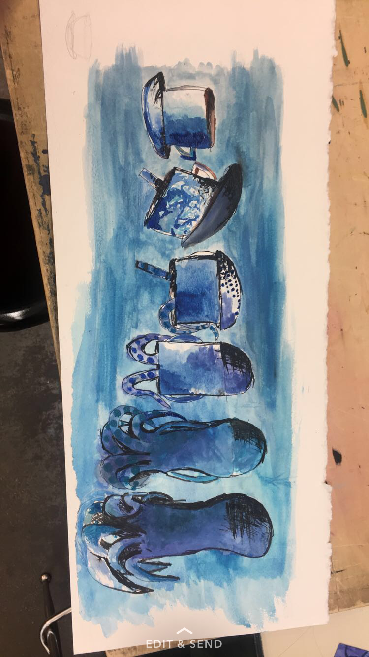 Also, my last two phases of metamorphosis were not up to standard stylistically and realistically, so as per Mrs. Maclay's suggestion the last two stages were thrown out and a new, more realistic squid was created. It got the most emphasis as it was scaled up in size in contrast to the other segments. It was a decision for the best as the last two squids honestly were pretty un squid like and were just blobs of paint in the shape of a "peanut." I was assured that having only 5 stages of metamorphosis would be acceptable as the other squids were that bad. 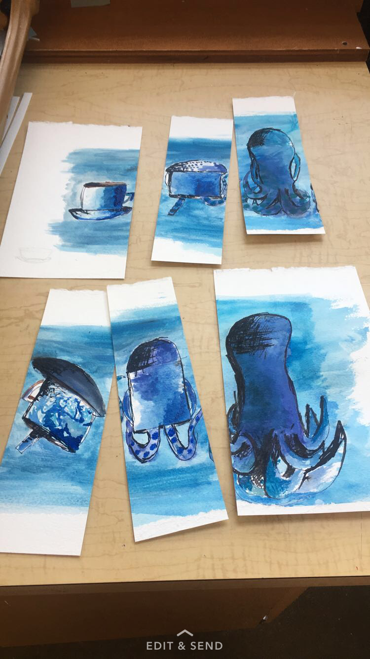 After watching an encaustic demo by Mrs. Maclay I really got interested in the effects of it. She lent me the book, "Surface Treatment Workshop" by Darlene Olivia McElroy & Sandra Duran Wilson. On page 26 I found a section titled, "Faux Encaustic" and it used acrylic mediums to achieve the encaustic effect and look. To incorporate this I decided to individually cut out each section of metamorphosis and attach it to a deep sea themed canvas with this method. First, I used an array of blues, white, yellow and green acrylic paints to get a smooth deep sea background on the wide, landscape canvas. Then I used an opaque pouring medium that I created by diluting fluid matte medium with water at about 20% and layered it over the paint as per the book's instructions. Finally I took each image and used pure matte medium to attach each transition. 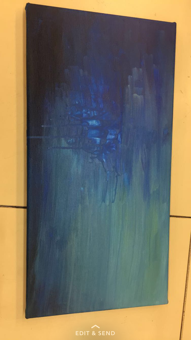 Overall, I think my work was original in that it looks completely different from my reference images and was just derived from inspirational works. I am glad that I chose the mediums that I did because I think from the Scholastic 144 project to this one growth is really visible in both water color and acrylic. I am personally a lot happier with how this piece turned out compared to the last one which I can barely look at now. Some things I could have done differently include looking more at reference images (why my squids initially were horrible) right off the bat. This would have saved time and not looking at a reference image was really not smart, I guess I must have forgot? I really have no idea what I was thinking there. Most importantly I think the bridge from watercolor to acrylic was so much more appropriately done compared to the last project. Finally, I am satisfied in the overcoming the challenges and taking artistic risks in new mediums (ink & acrylic matte medium) to still keep the teacup to squid idea. 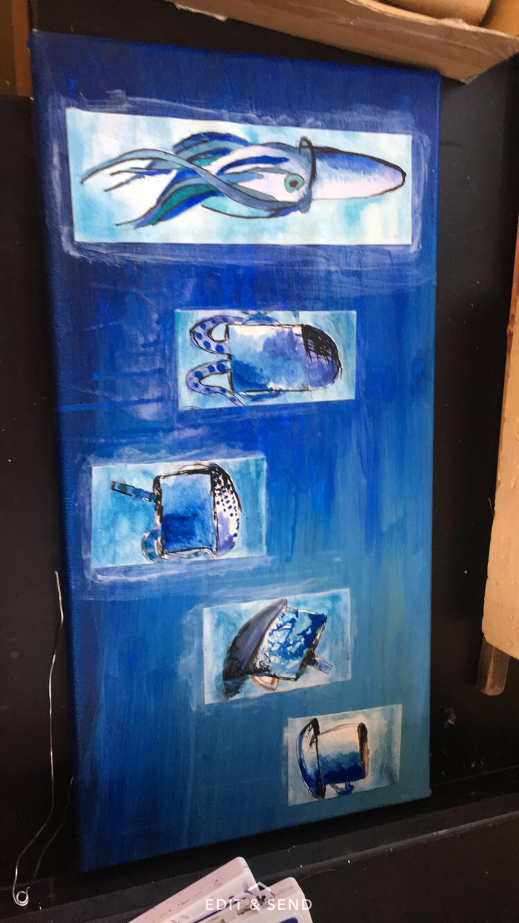 International: Global Climate Change, Brink of Nuclear War, Hurricanes and Natural Disasters
|
AuthorWrite something about yourself. No need to be fancy, just an overview. Archives
October 2017
Categories |


 RSS Feed
