|
The objective of this project was to create a piece that had a narrative or rhetorical message behind imagery. I decided to use pollution of the environment as my topic for this project as it is something I have always been passionate about. It also fits into my 'blue' theme of art projects for this class so far, which is cool. As always, deciding which medium to use was a long, twisting winding road. My original thoughts were 3D, but I couldn't decide if paper sculpture or cardboard sculpture would really work the way I envisioned and eventually ENCAUSTICS fell into my lap. Other people in the class began using it and the supplies were already available. I watched the demonstration in class and all the encaustic work I had seen so far was stuff I was interested in making myself. Foolishly, this process of actually figuring out what I actually wanted to do and which medium took up a lot of studio time, so I had to get moving with just less than a week of studio time left. Here are some inspirational encaustic pieces I found: 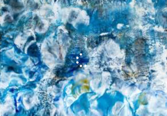 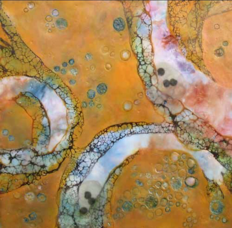 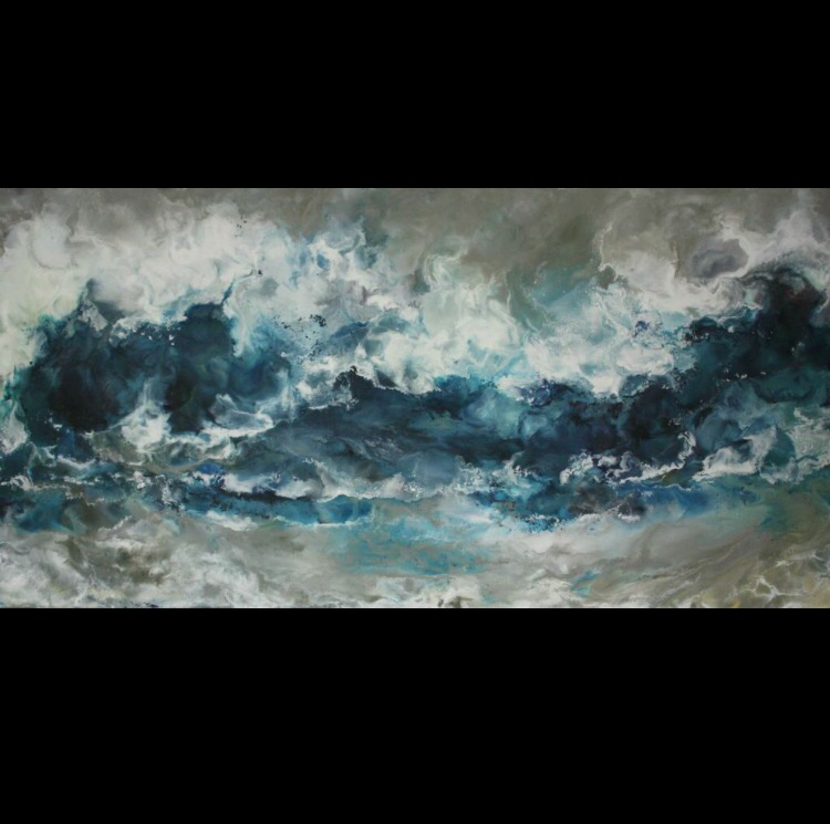 Below is my compositional sketch. I incorporated the basic elements of sea life, pollution, and horizon line but de-structured it a little bit in order to give the piece a looser feel. Note that this sketch was intended for a 18X18 piece of plywood, but after reconsideration I ended up using a rectangular board instead so the foundation had to be slightly rearranged. 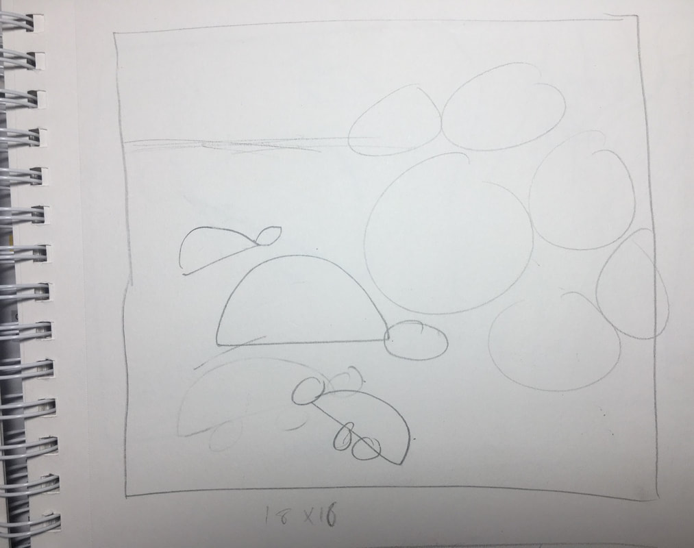 With the help of Mrs. Maclay we found a long rectangular piece of wood that we deemed sufficient. The first few steps of the actual project were sanding the board down, with sandpaper, to make it smoother and softer. Next I gesso-ed over the entire board, front back and in between for a base layer. Finally I could begin playing with the wax. I used cerulean blue, dark green, white, clear, and yellow in the board and mixed them to get different shades to help emphasize the deeper ocean and the closer to the surface. I used quick, short brush strokes to cover the board. The wax is fun, but it dries very quickly and so the swift strokes worked in my favor. 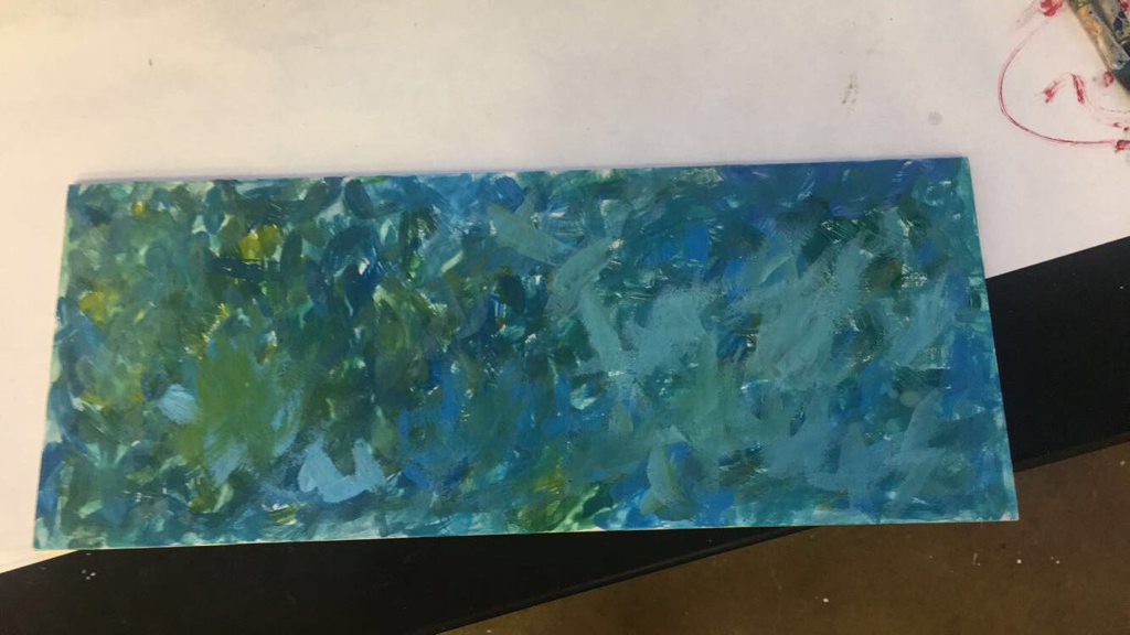 I was really happy with the way the background turned out. The texture that the wax gives and the depth the clear wax adds is interesting but not too messy and rough. The wax is smooth enough to capture the smooth waves of water and the color scheme is something I am most fond of. When I asked people in the class what they had thought of it so far, they replied with "ocean" so that was good that it was recognizable. I found a piece of gold wax and got really excited about it, so I found some yellows and white to mix together to quickly brush on the top of the piece to help emphasize the surface and horizon line. Next, I turned the board vertically. I cut out colored images off turtles with an exact-o-knife and used the clear wax as an adhesive to paste them into the painting down to the blue, darker toned deep sea. Next, I used the scraps of blue printed ink from the pictures to cut out circles representing bubbles from the turtles. Sea turtles have to come up for air and the bubbles coming from them eventually turned into circles of trash that they were breathing out, and finally evolved into a 6-pack soda ring. It was cool to incorporate an element of metamorphosis into the piece using this and I think it shows some growth in skills I have learned over the past 9 weeks. I also cut out a turtle shadow out of trash to help this imagery. From this point I began making the piece more decadent. I used tissue paper and paper towels to add a 3D element by attaching them to expand on the trash in the water, putting it near the soda rings to keep my element of metamorphosis intact. Inside of that, I scratched out the symbol paired with the saying, "reduce, reuse, recycle" by using a tool to carve out the arrows. Then I filled it with light blue acrylic paint and wiped it away to fill in the carving. Unfortunately I let the acrylic dry for too long and had to scrape the excess paint off with tools but it still is a really cool design to add to the piece and strongly reinforces my social commentary aspect of the piece. The location of it, too enhances the message I am giving off as I put in literally in the floating trash. Other finessing flairs I added were the circles just above the 6-pack soda rings (metamorphosis!) by taking the cans of wax and circling the bottom in wax on the hot plate and pressing it into the board. The purple and orange are really cool contrasting colors I think. I also got to use a nut/bolt to imprint more circles into the piece and I added a horizontal line of three circles at the left hand corner to add some element of design and geometry. 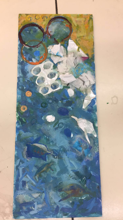 The final piece I am excited that I got to try encaustics and collaging, as coming into this class were two things I wanted to try and learn about. I love the look of encaustics and it may be my favorite medium to work with now. I absolutely love the blue brush strokes in the background. I am also really happy with the result of my piece and the positive excitement I have gotten from encaustics, it is a good way to go out from the Portfolio class and gives me a platform to dive off into artistically now that this class has ended.
0 Comments
Leave a Reply. |
AuthorWrite something about yourself. No need to be fancy, just an overview. Archives
October 2017
Categories |
 RSS Feed
