|
Just as a recap, the main idea of this project was to turn one inanimate object into another inanimate or animate object using at least 6 stages to metamorphosis to use as a transition from one subject to another. My inspiration for the subjects for this project originated from the studio's field trip to Harrisburg's State Museum and the Millworks galleries. As I looked back on photos from the artist exhibits, I saw a a painting of a squid that I particularly liked, and a collage of a teacup that I also grew a liking too, and right then and there I got totally, completely married to this idea, for better or worse. 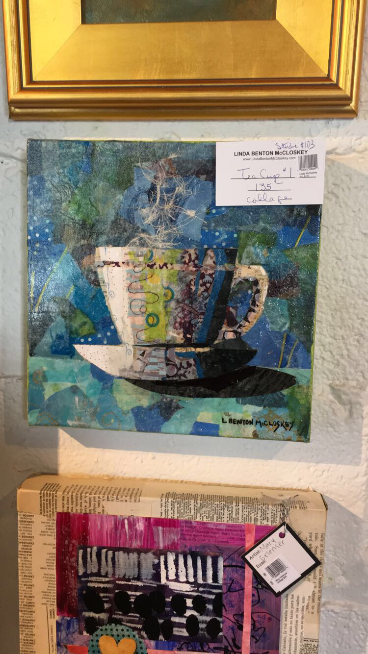 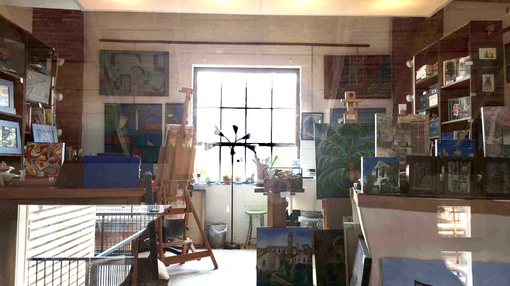 (the squid is in the back of the studio) However I immediately ran into challenges. While I got the transitions down in my sketchbook, I had a lot of trouble with the composition of it. Teacups and squids really don't share a similar environment like EVER, since one is deeply underwater and teacups aren't really in the ocean that much. I spent a significant amount of time sketching the transitions in thumbnails and practicing water coloring the objects. 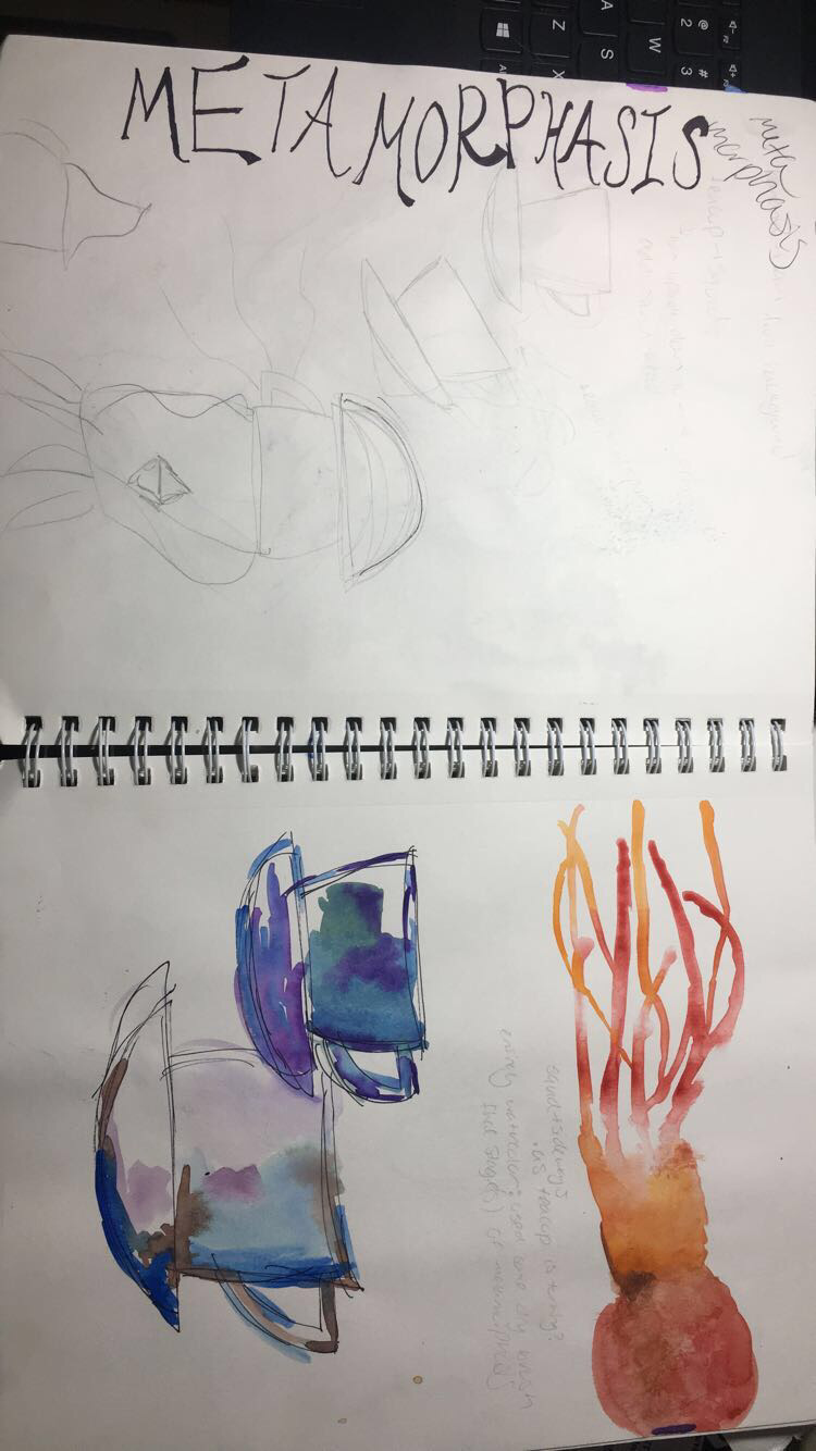 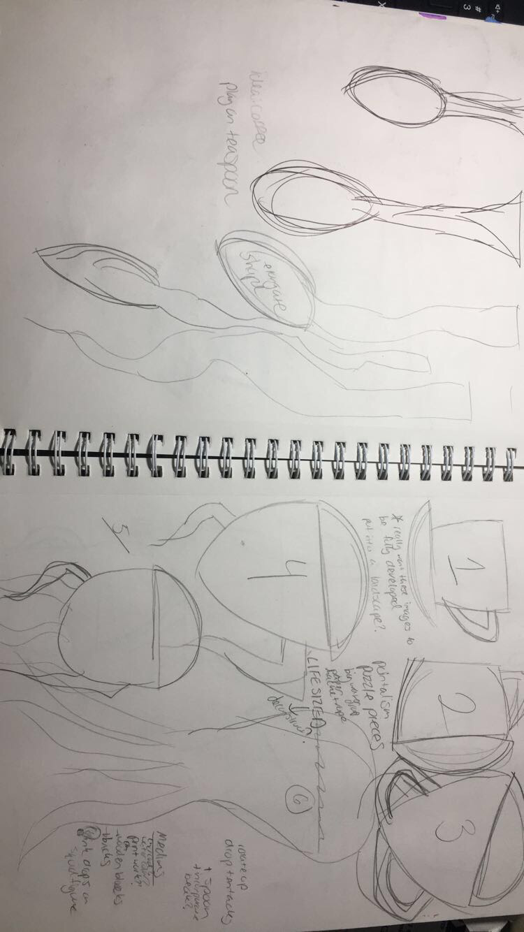 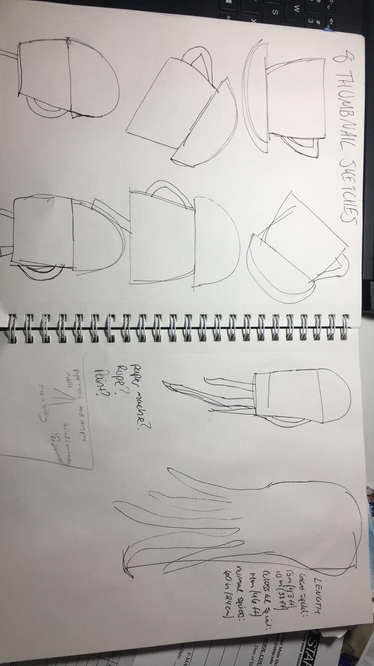 I also encountered a challenge when I was picking a medium. I think that one of the most exciting aspects of an open studio class is the opportunity to learn about a vast array of mediums & techniques, and I really wanted to take advantage of that. Since the last project I did was pretty much just watercolor, I was hoping that printmaking would be a new way to communicate the metamorphosis and give me a good learning opportunity in a new skill set. I also tried some oil pastels mixed with watercolor out, too. I started working some different approaches out in my sketchbook as well for practice, located below: 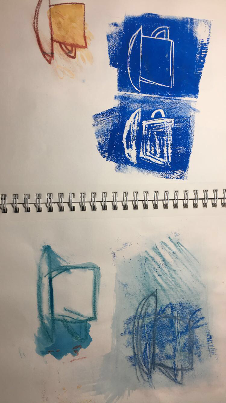 In the end, however, I decided that none of these methods really had the likeness and style that I had envisioned and gotten married too. I felt that with printmaking, the detailing wouldn't be able to be at the level I wanted, and the oil pastel work I had done with watercolor was too similar to what I had done on the last project and I wanted to branch out more... ...So of course I ended up back at watercolors and ink to do the transitions on some basic white watercolor paper to get the project up and running finally. I really enjoyed and had fun with the illustrative teacups I had done earlier in my sketchbook and really wanted to play off of that stylistically. So I went ahead and created 6 stages of metamorphosis in a fine point sharpie and began using mostly blue hues and some purple to add values and shades for fun. As they progressed, Mrs. Maclay suggested that I incorporate ink into it more to reinforce some lines and embrace the stylistic nature of it. I used basic quill in ink to add more value and define the shapes a bit more to make them more realistic and bold by cross-hatching. 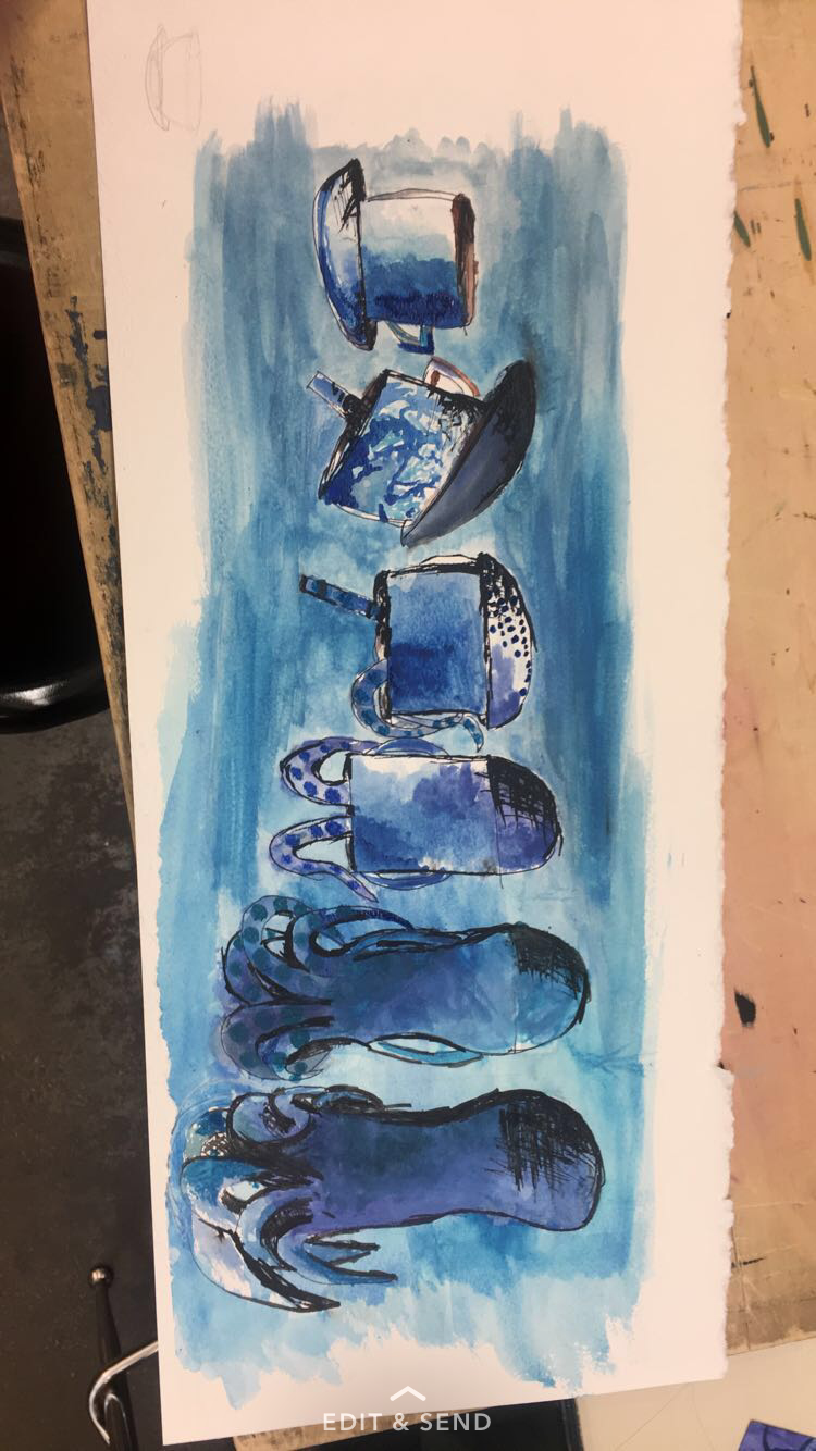 Also, my last two phases of metamorphosis were not up to standard stylistically and realistically, so as per Mrs. Maclay's suggestion the last two stages were thrown out and a new, more realistic squid was created. It got the most emphasis as it was scaled up in size in contrast to the other segments. It was a decision for the best as the last two squids honestly were pretty un squid like and were just blobs of paint in the shape of a "peanut." I was assured that having only 5 stages of metamorphosis would be acceptable as the other squids were that bad. 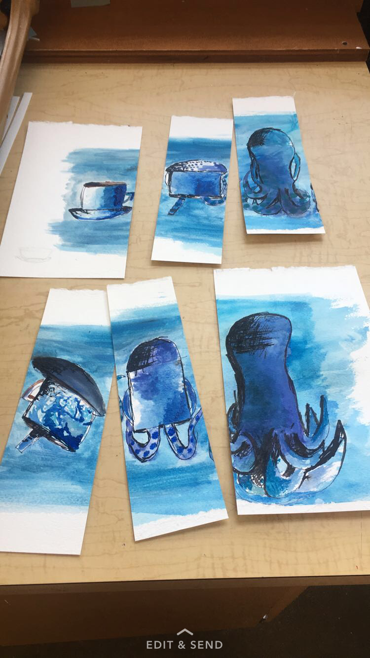 After watching an encaustic demo by Mrs. Maclay I really got interested in the effects of it. She lent me the book, "Surface Treatment Workshop" by Darlene Olivia McElroy & Sandra Duran Wilson. On page 26 I found a section titled, "Faux Encaustic" and it used acrylic mediums to achieve the encaustic effect and look. To incorporate this I decided to individually cut out each section of metamorphosis and attach it to a deep sea themed canvas with this method. First, I used an array of blues, white, yellow and green acrylic paints to get a smooth deep sea background on the wide, landscape canvas. Then I used an opaque pouring medium that I created by diluting fluid matte medium with water at about 20% and layered it over the paint as per the book's instructions. Finally I took each image and used pure matte medium to attach each transition. 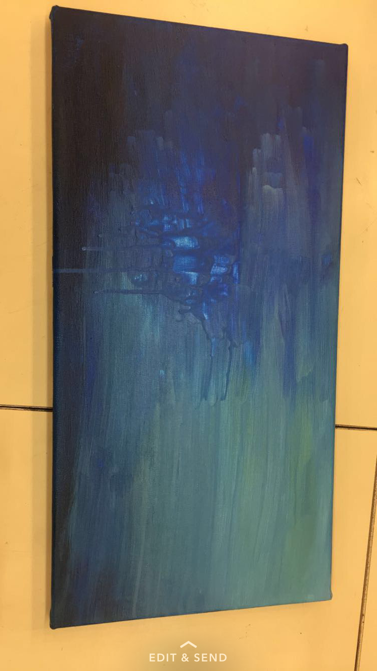 Overall, I think my work was original in that it looks completely different from my reference images and was just derived from inspirational works. I am glad that I chose the mediums that I did because I think from the Scholastic 144 project to this one growth is really visible in both water color and acrylic. I am personally a lot happier with how this piece turned out compared to the last one which I can barely look at now. Some things I could have done differently include looking more at reference images (why my squids initially were horrible) right off the bat. This would have saved time and not looking at a reference image was really not smart, I guess I must have forgot? I really have no idea what I was thinking there. Most importantly I think the bridge from watercolor to acrylic was so much more appropriately done compared to the last project. Finally, I am satisfied in the overcoming the challenges and taking artistic risks in new mediums (ink & acrylic matte medium) to still keep the teacup to squid idea. 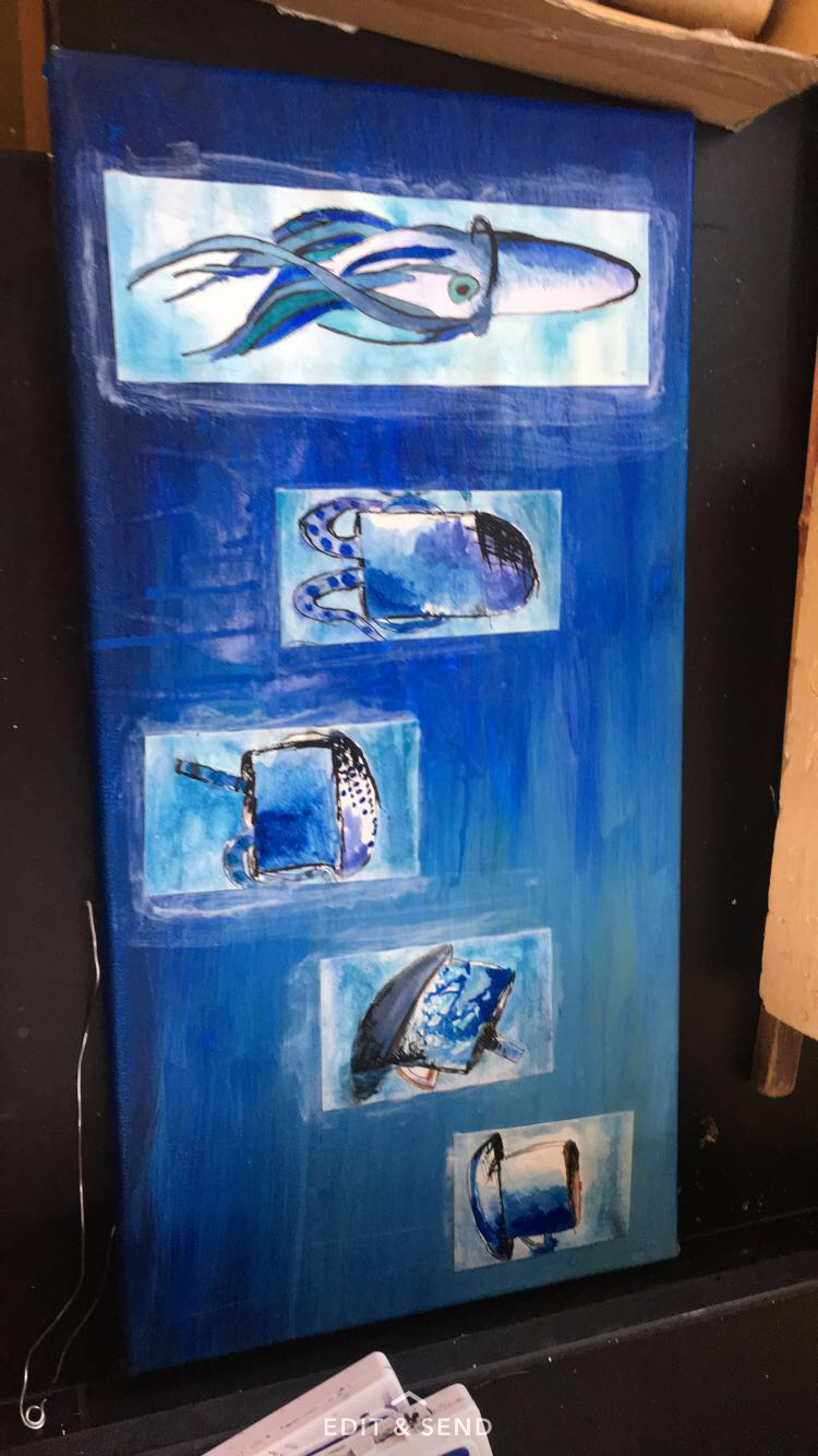
0 Comments
Leave a Reply. |
AuthorWrite something about yourself. No need to be fancy, just an overview. Archives
October 2017
Categories |
 RSS Feed
